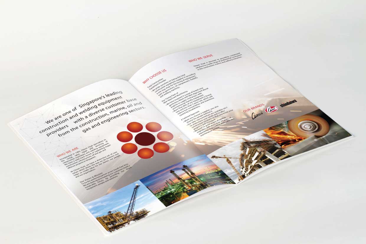
A great brochure design is important to all companies as it is the first publicity and marketing material that you will show to your potential clients. Thus creating a visually appealing brochure design with great graphics, layout and art direction that can bring out your products or services is a very important design aspect to consider.
For the cover design, the key visual is focused on the products with a background of Singapore city skyline, coupled with an invisible network grid that is powering the city. The use of colour closer to the brand and energy can be seen on this cover design. The hue and colour applied no the cover is done subtly and with elegance to make you feel the energy imbued on this cover.
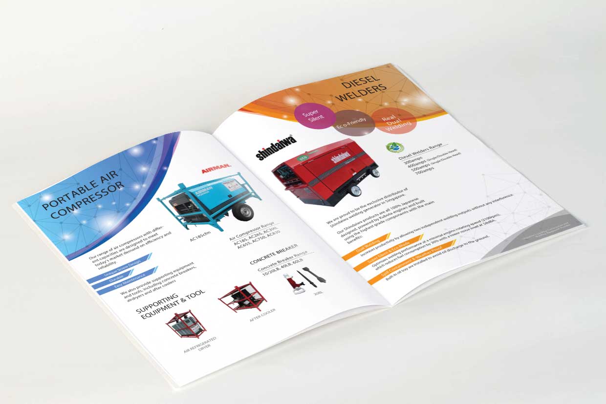
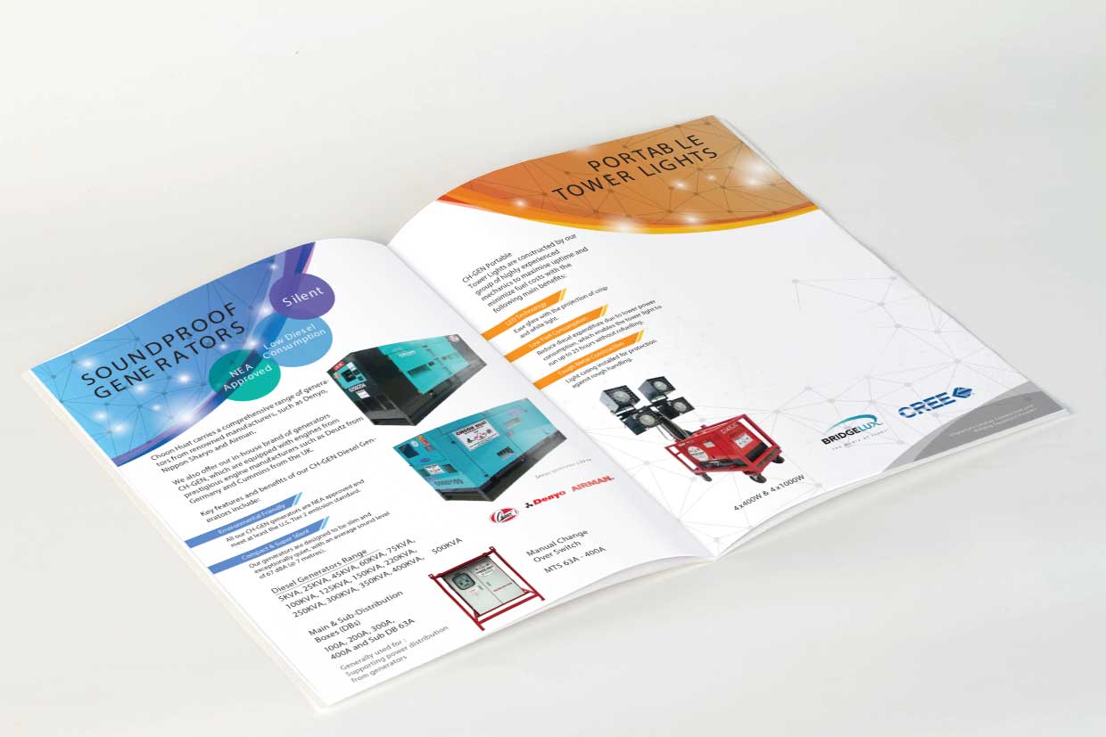
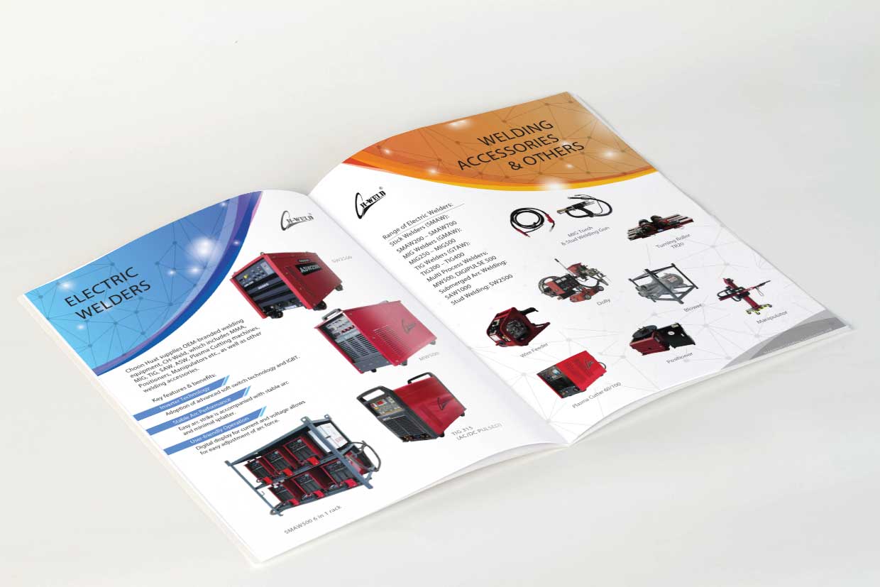
The primary colours used throughout the brochure are mainly blue and orange which relates to energy. Network lines used as background to depict a connected power grid visually. The rest are mostly basic layouts to present each products clearly with the correct data. The graphic design elements on each top corners is designed in such a manner to create a consistency of the dome shaped network grid that was introduced on the cover.
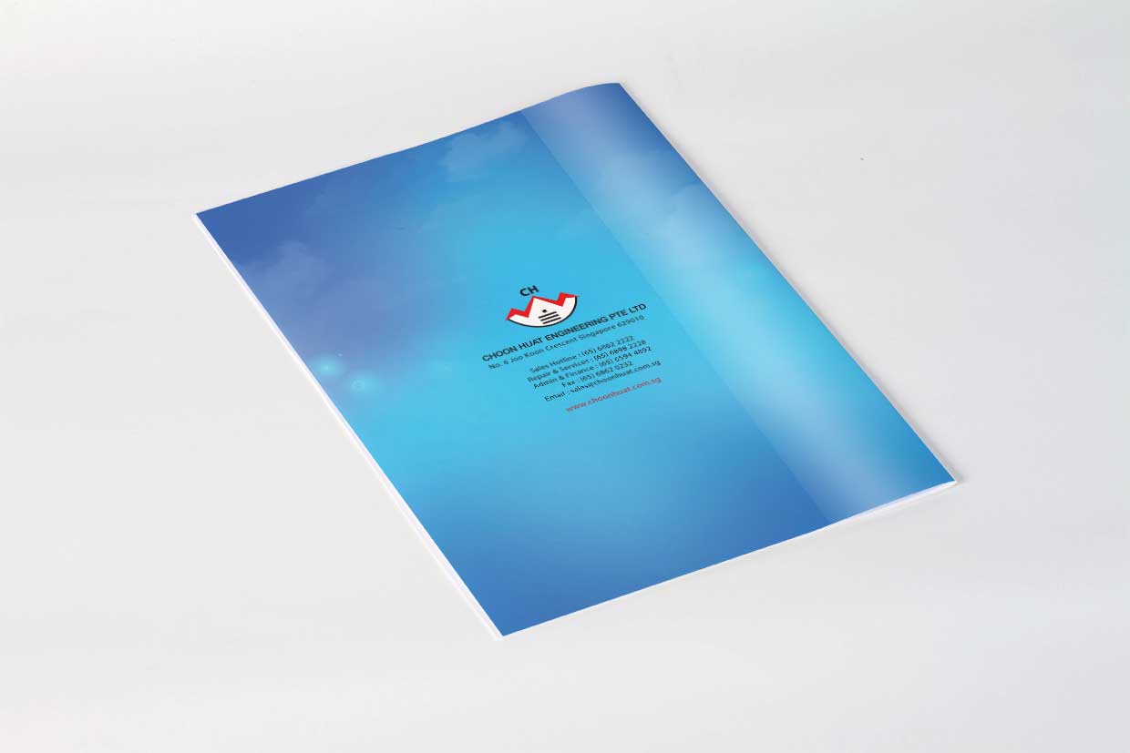
The company’s information and contact details can be found at the back cover.
If you are looking for a beautiful brochure design that captures attention and bring you more leads, please email our Diseno team at sales@diseno.com.sg